Re-Branding Design
azero
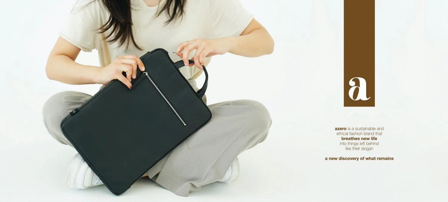
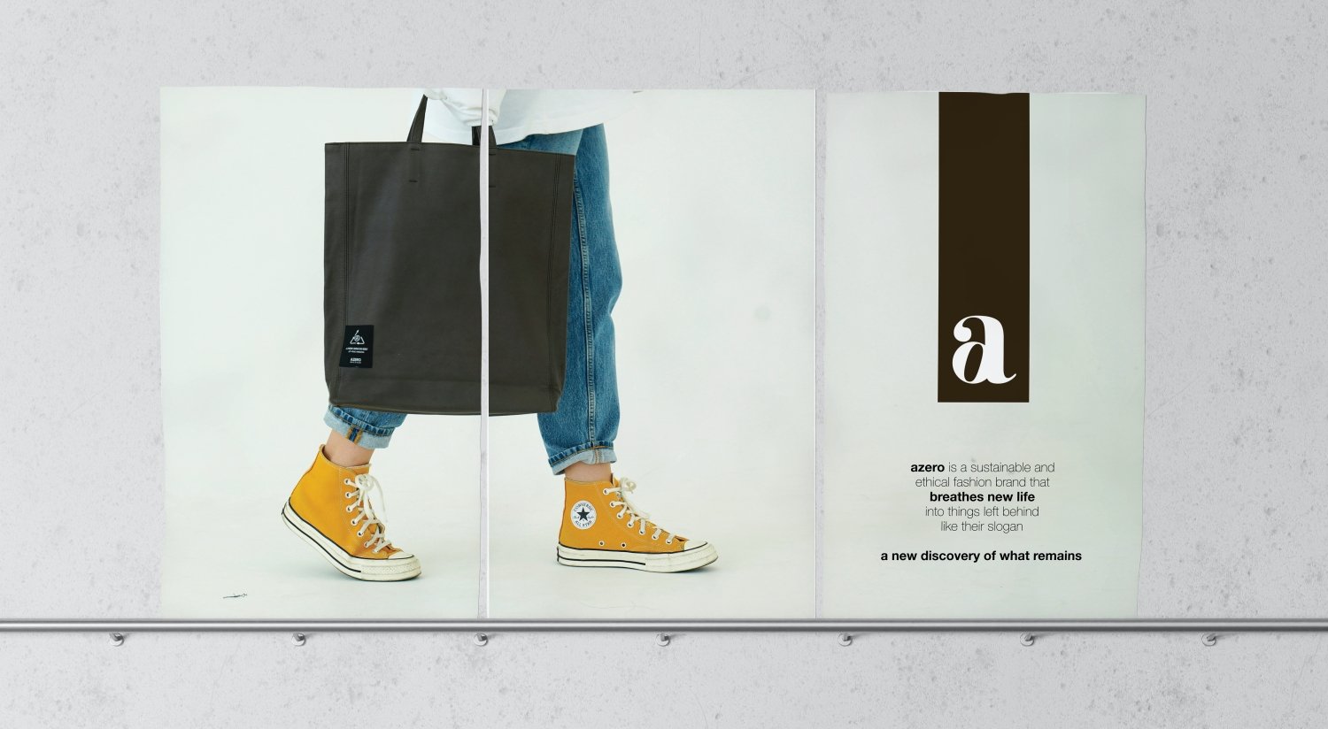
AZERO is a real brand in Korea. They are sustainable, ethical fashion brands that breathe new life into what's left, like their slogan, 'A new discovery of what remains.' However, they are not known to many people because the Brand Identity System is not properly established. Therefore, I newly built an integrated design system through Re-branding so that products containing their philosophy can be best introduced and purchased by customers.
About AZERO
Problem recognition
In the existing logo of AZERO, an icon meaning 'recycling' was added. This was also interpreted to mean that people use "the leather of a product that someone used" rather than "the leather left over from making clothes." As a result, some people were reluctant to use AZERO products. In addition, as the proportion of AZERO's products made of vegan leather has increased recently, the icon was judged to be unnecessary.
Solution plan
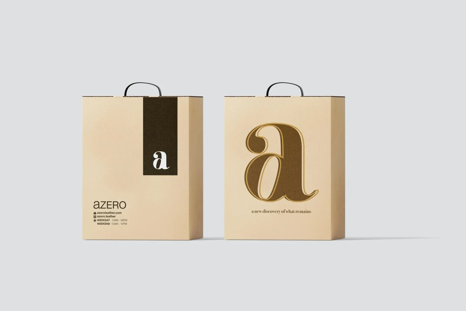
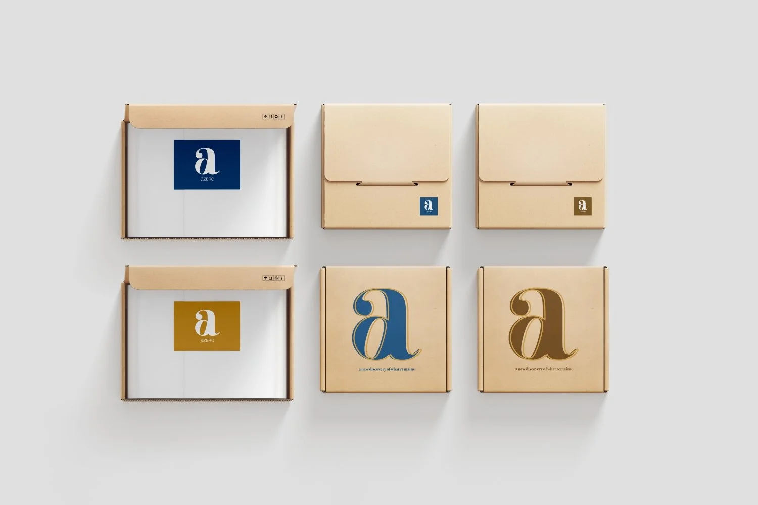
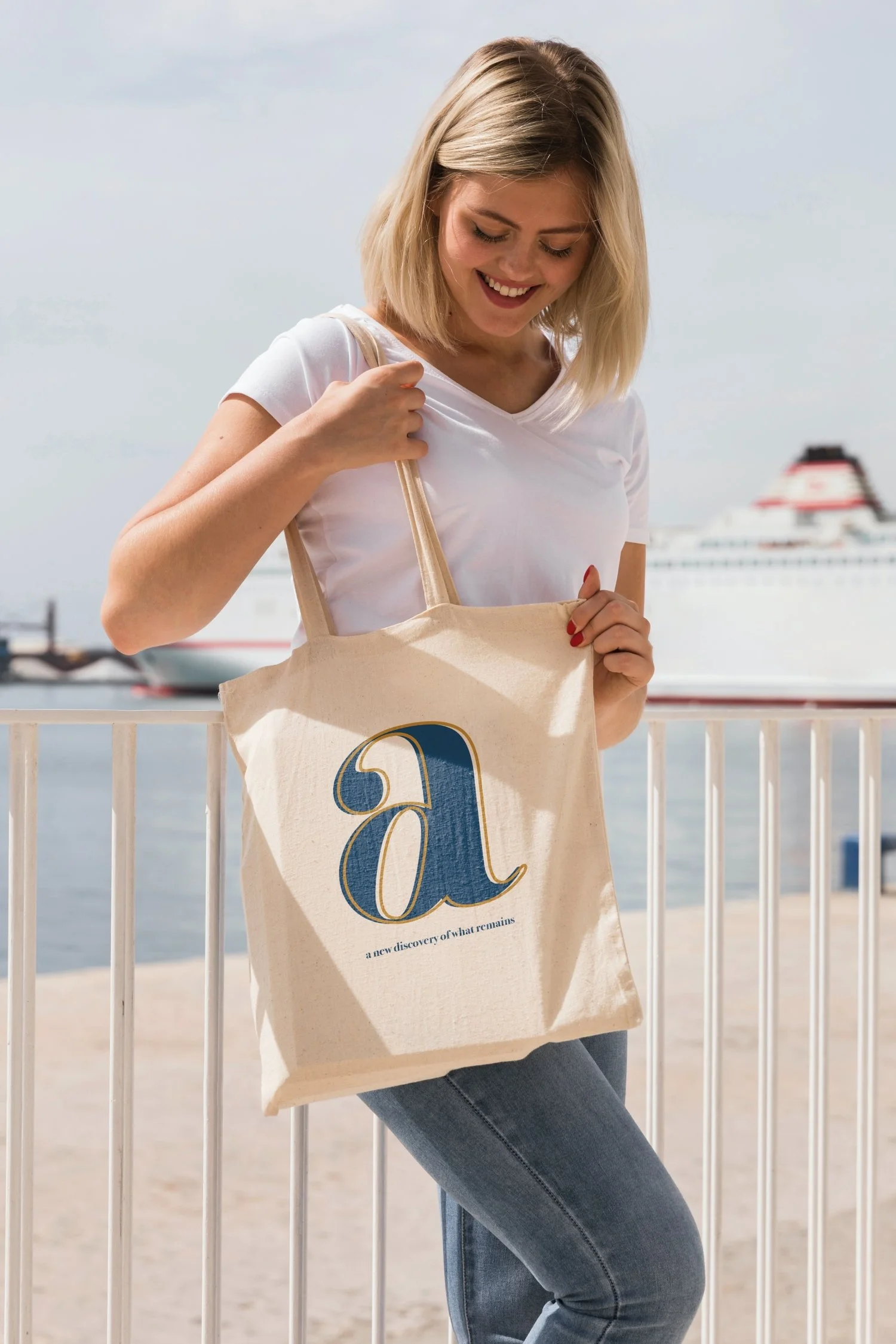
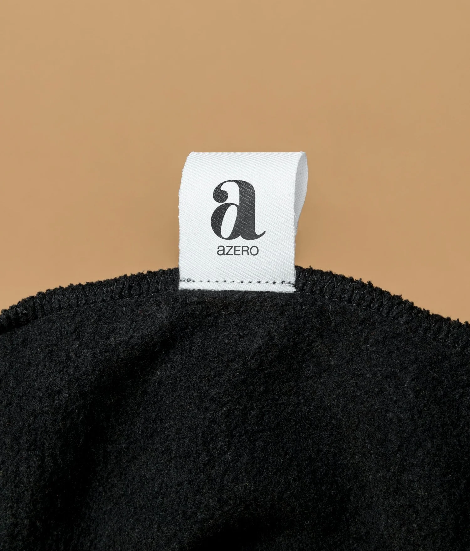
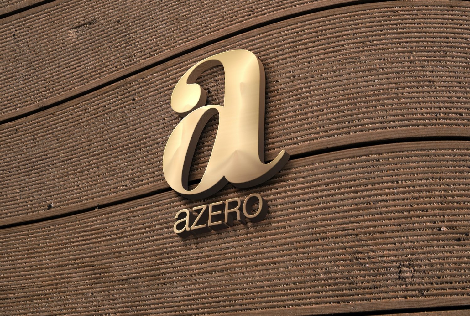
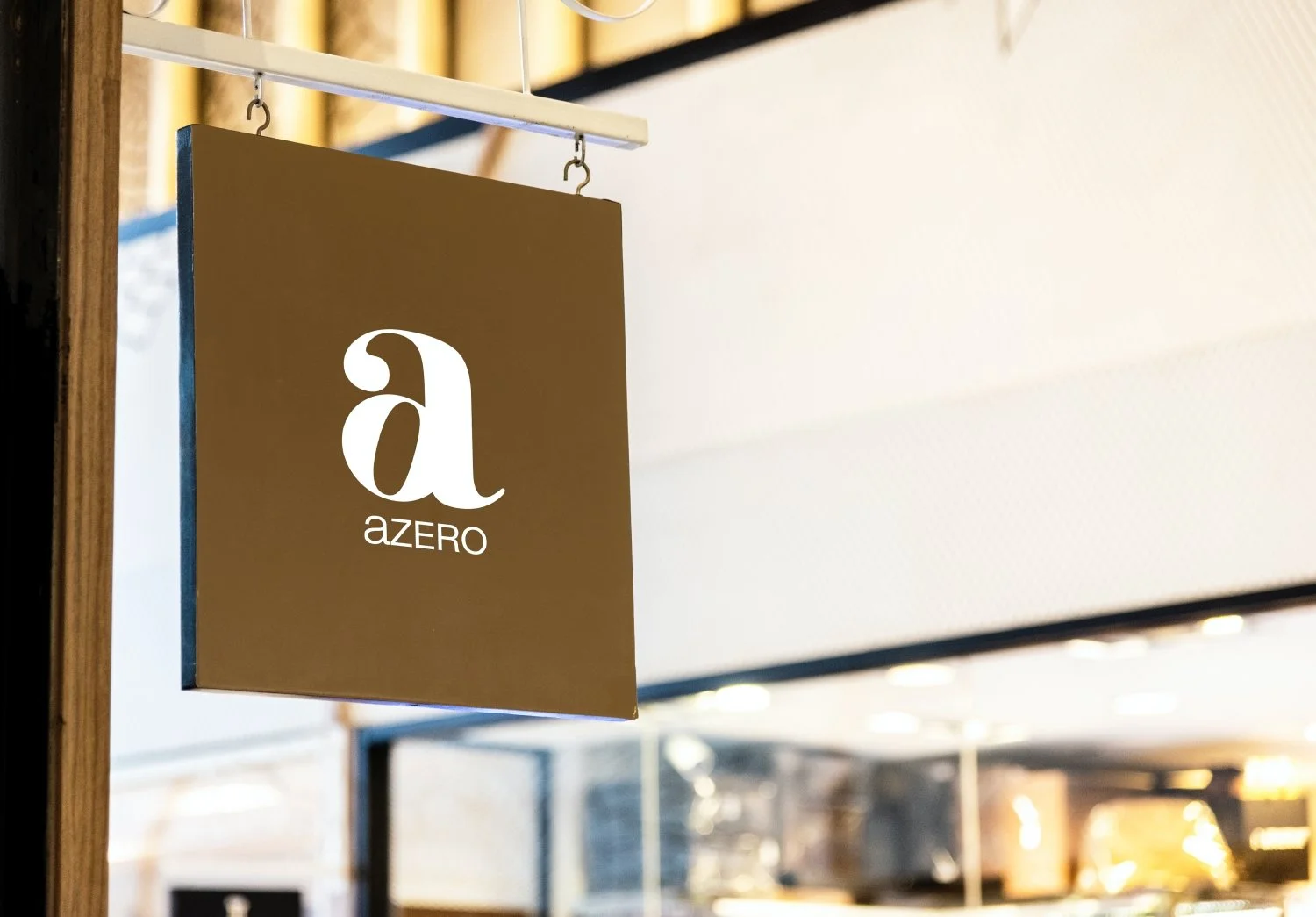
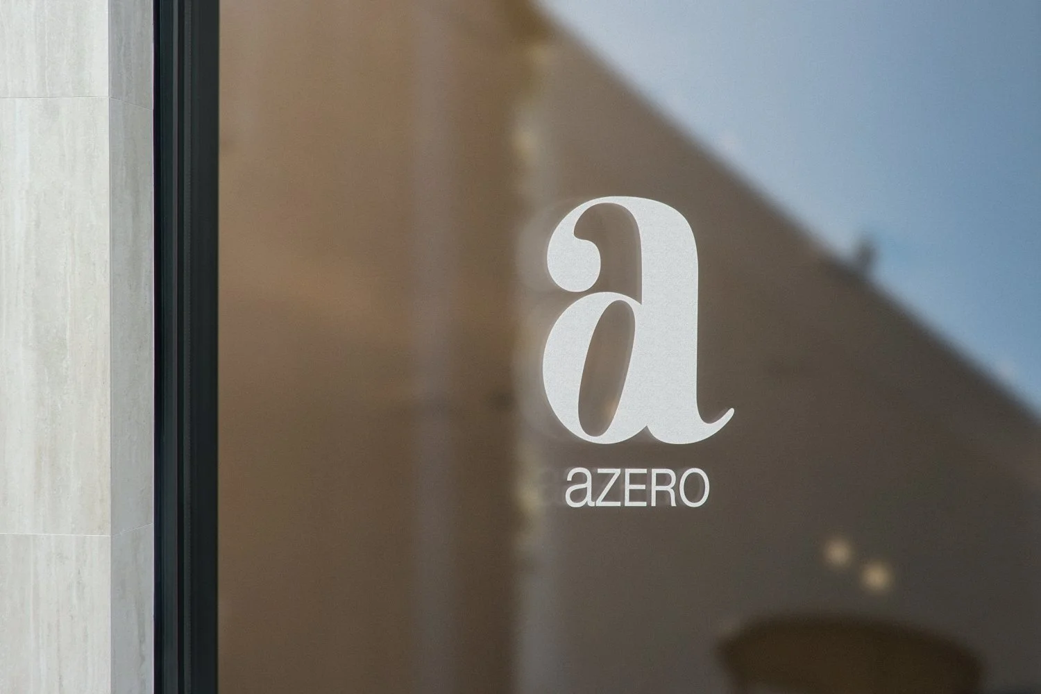
I made a symbol with a combination of the lowercase letter 'a' and zero (0). In addition, the lowercase letter "a" and the capital letter "ZERO" were used for text marks. This all included the logo meaning that AZERO's challenge is a very small start, but that animals will not be indiscriminately victimized by people's greed in the future. I would like to emphasize the '0' that goes into the symbol is slightly tilted to the side. This is a metaphorical expression of AZERO challenging fields that others do not challenge in a creative way.
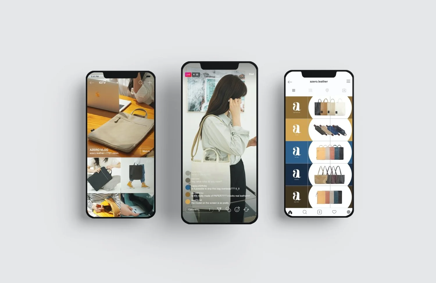
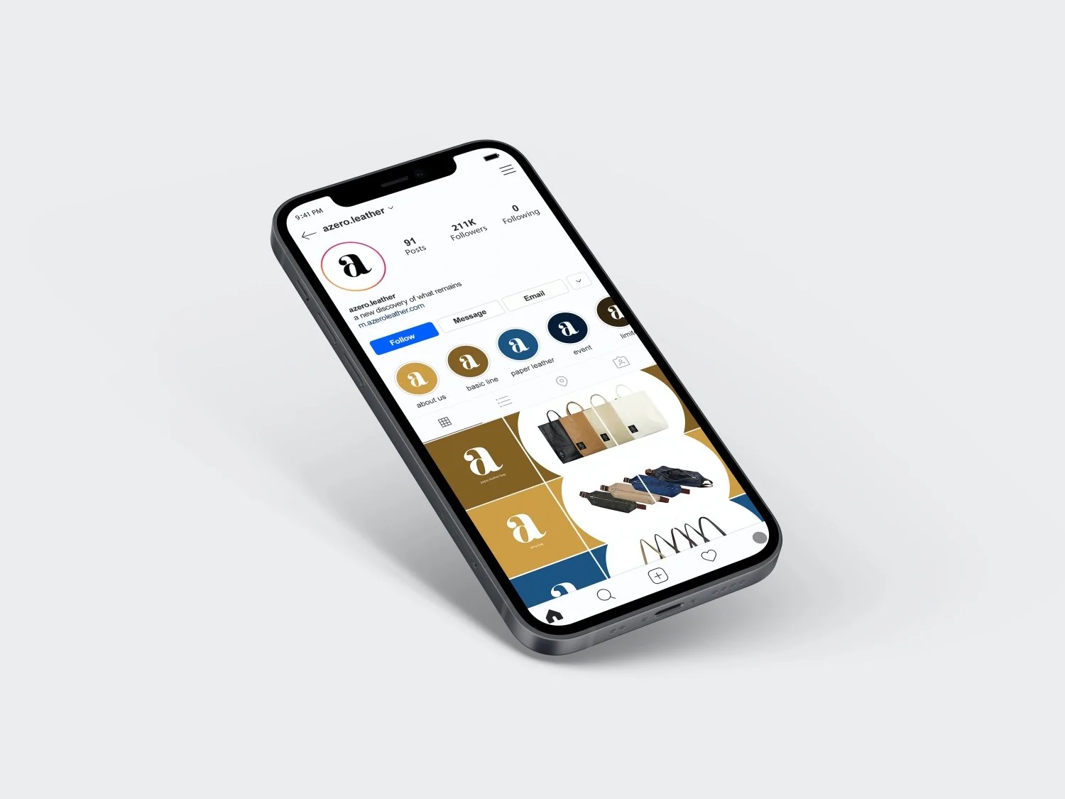
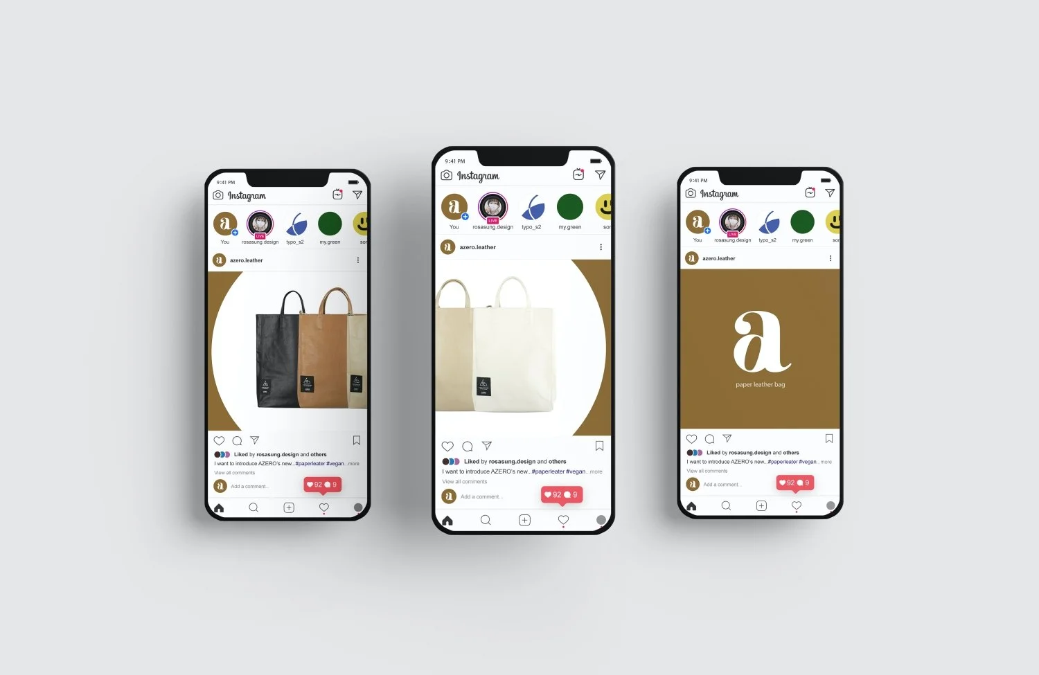
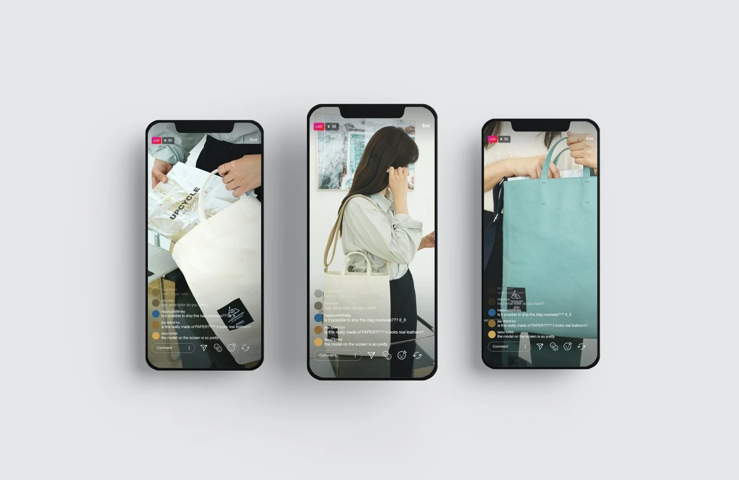
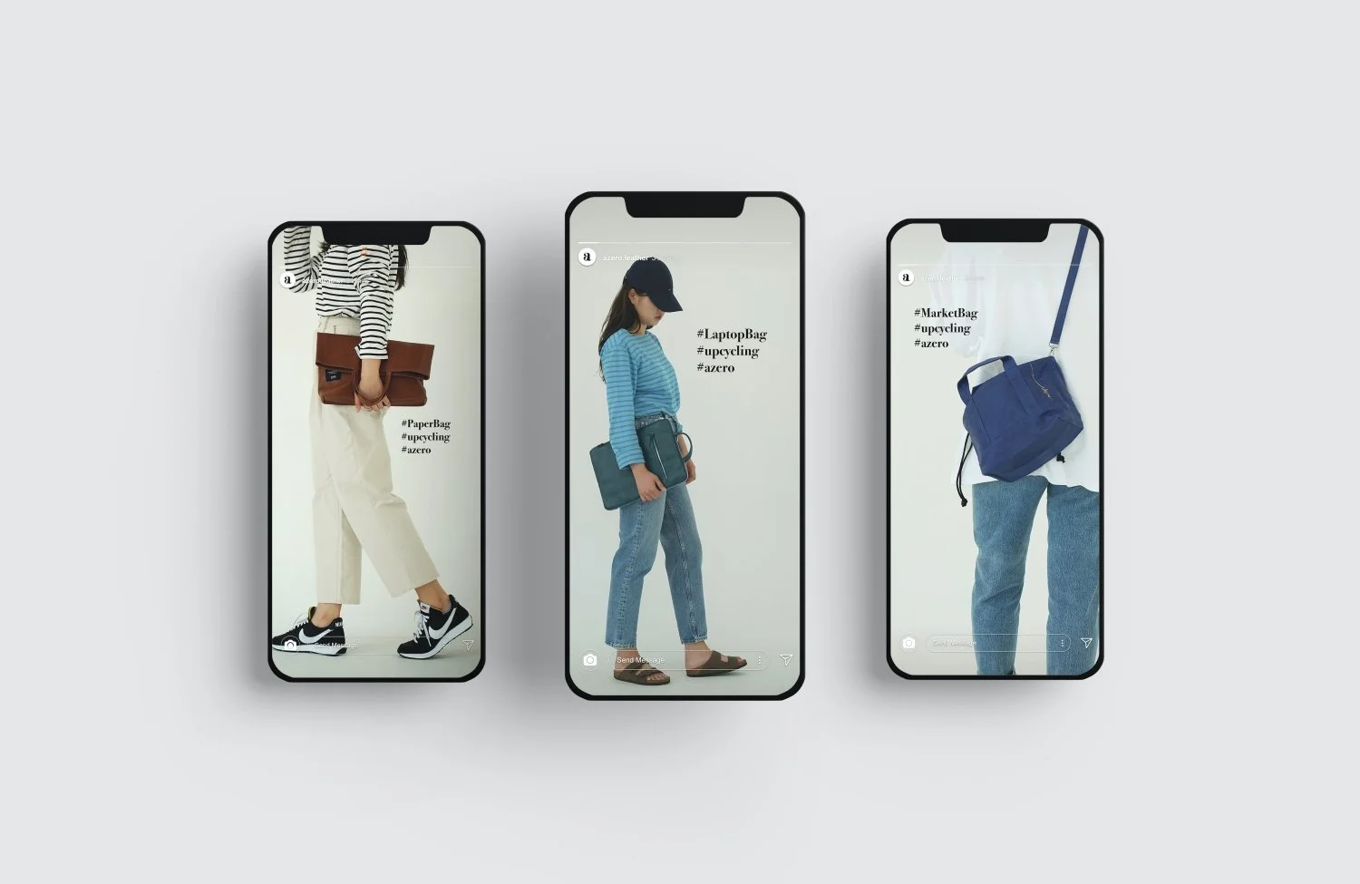
SOCAIL MEDIA & DIGITAL FLYER DESIGN
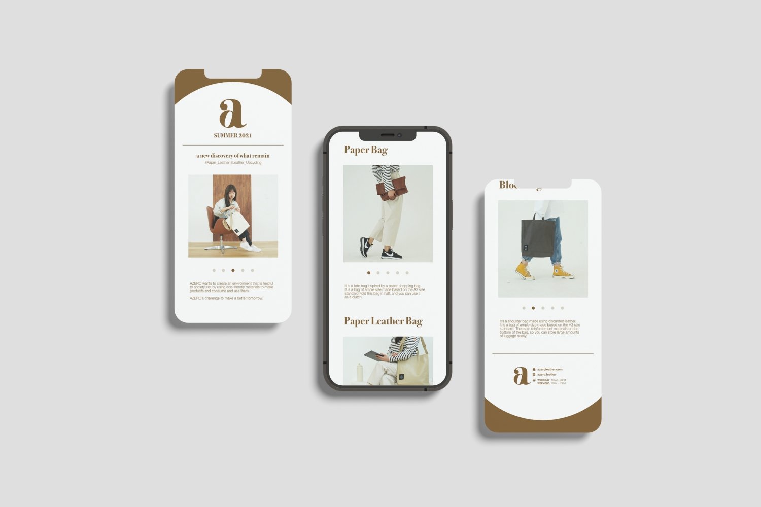
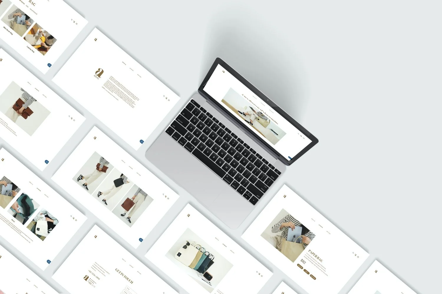
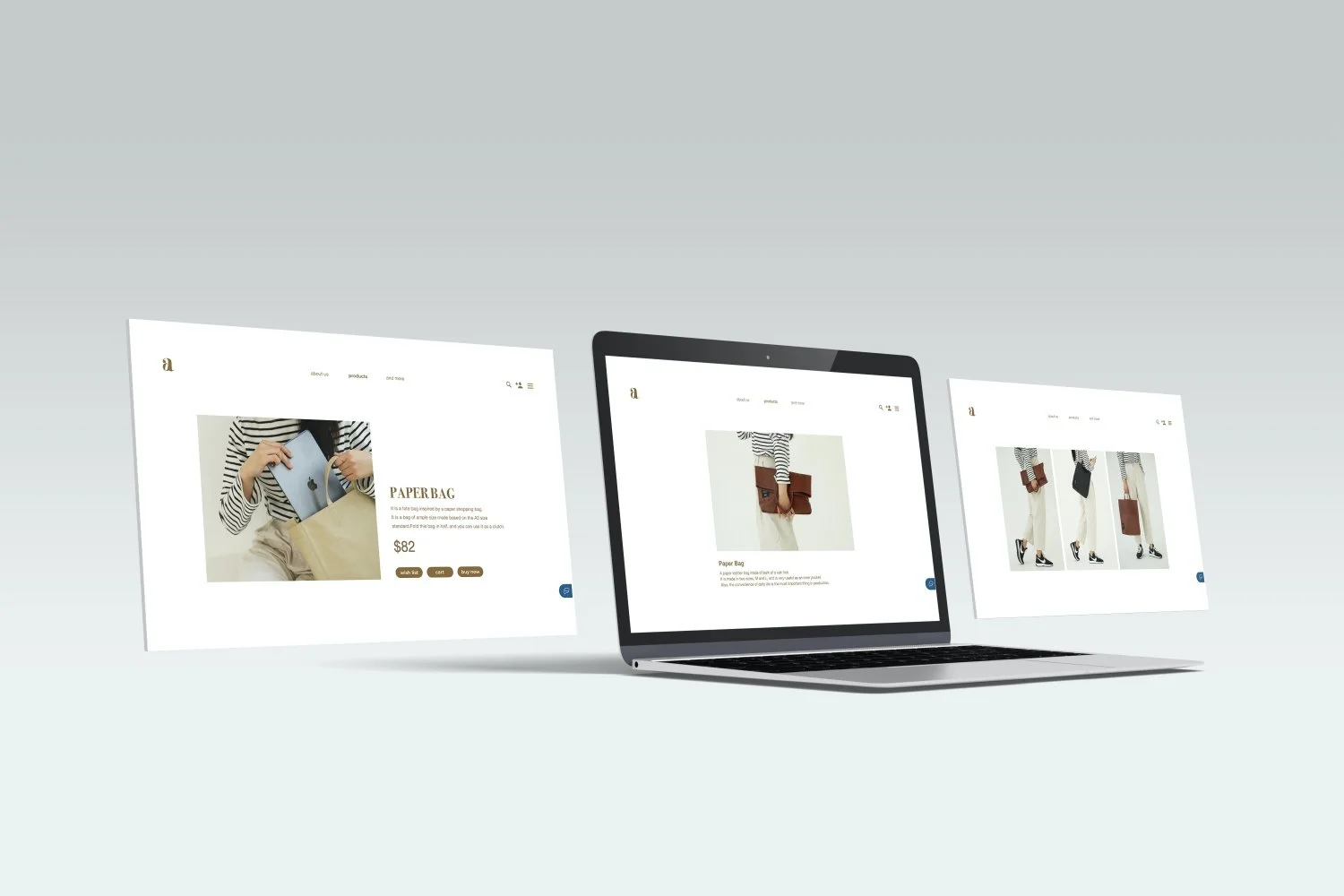
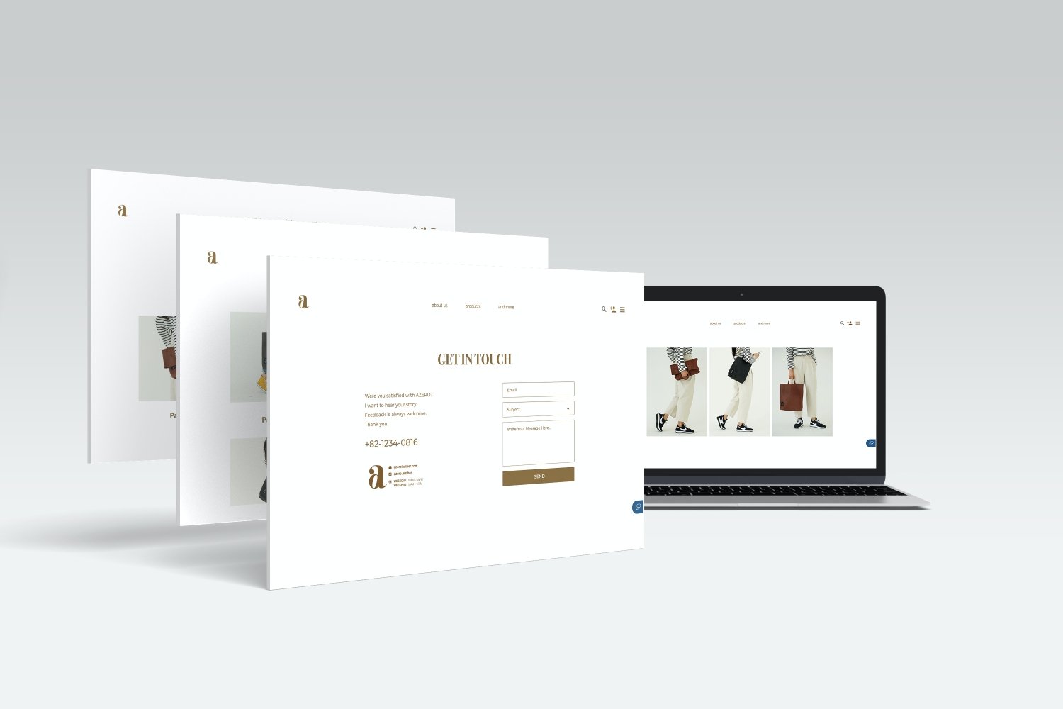
WEB DESIGN
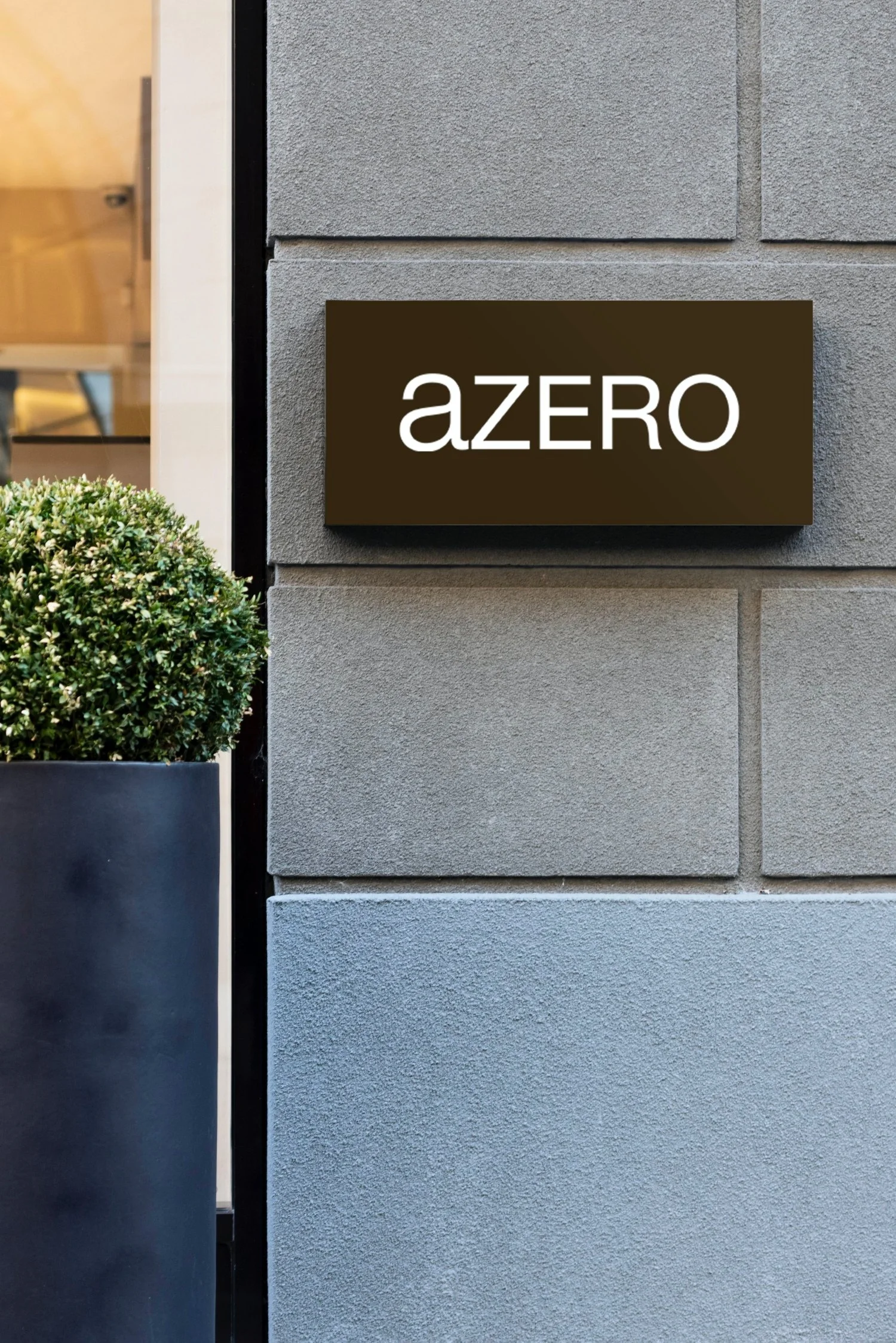
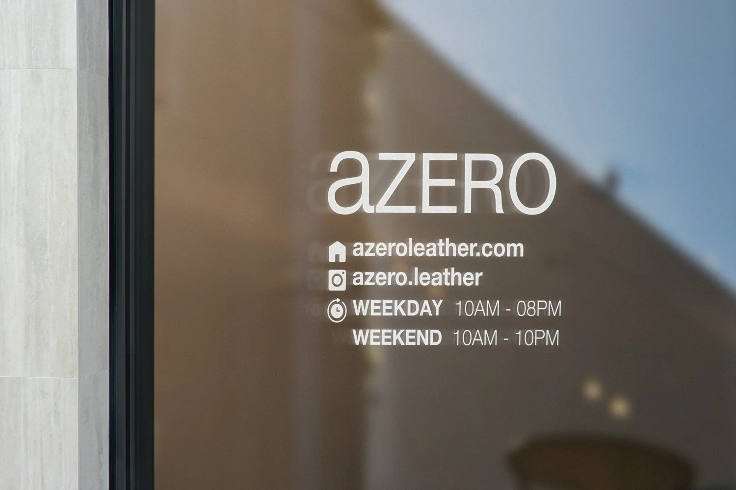
SIGN BOARD DESIGN
PACAKAGE & LABEL DESIGN